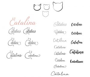
With a name like Catalina, I knew I wanted to incorporate a cat. In school, I played with silhouettes of cat faces and ears around letters, but it still didn’t feel right. I focused to much on creating “Cat” and not growing “Catalina.”
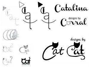
One of my early sketches shows I had tried extending the baseline of the “C” into a tail. Again, it didn’t look or feel right at the time, so I moved forward in other directions for school projects.
After more classes requiring illustration practice and projects, I went back to my branding. My confidence m there, it was all about finding the right typography. I love calligraphy, so I started my search through script fonts: elegant yet legible.